| |
|
|
|
| |
Articles & Reviews |
|
|
A Student's Reflection on Making Pots for Use Olivia Horley |
|||||||||||||||
At the core of Olivia Horley's essay is the belief that so-called 'functional' objects, such as cups and bowls, can 'evidence ideas as well as technical expertise'. She writes of her intuitive 'feel' for beauty, and of her pursuit of it through connecting with 'the broadest spectrum of serendipitous sources.' Her critical context often emerges in parallel with her sensual engagement with her materials. Some passages might be characterised as 'neo-formalist', so detailed is their consideration of the aesthetics of making. Others demonstrate just how richly writing can evoke the experience of touch. Horley's ultimate quest is for 'utilitarian innovation which invites the viewer to contemplate the object anew'. She relates her intellectual position to 'two creative mindsets' and attempts to marry a desire for emotional content with 'a rationalist approach'. Such themes are mobilised in a minutely observed reflection on her creative process as the work emerges in studio Objects for use/Objects of use My work is concerned with objects for use. Surprisingly, at college there is still a pernicious, often unspoken perception which circumscribes objects for use within a limited world of function. Contrary to this, I see objects for use as being capable of addressing the widest emotional and aesthetic experience. Objects for use challenge us and offer as much as any artefact. I use the term 'objects for use' for convenience and see it as a momentarily useful critical tool. I do not hold with the author of the term,1 who distinguished categorically between 'Objects for use', 'Objects about use' and 'Objects beyond use'. Describing the latter, she claimed that they contain a 'nodal point where subjectivity, social identity, history, trade, production, the domestic, the ritual and ceremonial, intersect and collide'.2 My practice demands that a 'humble' cup also contain this nodal point. I ally myself with the Japanese aesthetic which sees no critical division between art and craft; with the notion that pots are an 'art of the mind'3 and evidence ideas as well as technical expertise; and with the idea that 'things work because they are needed'4 on all manner of levels: psychic, utilitarian , emotional, metaphysical, etc. To rephrase, I might say, that my work is concerned with objects of use.
'Beauty' I gather ideas through contemplation of the broadest spectrum of serendipitous sources: a watering can; a building; a landscape; a drawing; a design magazine; but, most consistently, from considering other ceramic works. There is little formal intention to reference or quote sources directly in the pots I make: rather they act as fillips to my imagination and in this way they are as incidental as they are various. However, these sources tend to be visual, despite the fact that tactile qualities ultimately become a defining element in my work. Nevertheless, I am drawn to artefacts whose visual content strongly invites or invokes the sense of touch even through the act of looking - a drawing by Cy Twombly with its gritty surface action; a sculpture by Louis Bourgeois in its fleshy plumpness; a painting by Mark Rothko which invites the whole body to immerse itself in colour. Despite this catholic diversity, there are controlling ideas which govern my approach. I look for utilitarian innovation which invites the user to contemplate the object anew, to fall in love with daily details again. What intrigues me is not a gimmicky, contrived innovation, but a reworking of the object which effects Weltanschauung and moves the user deeply. I have been inspired by a similarly holistic approach in companies such as Droog, who describe themselves as: '...a brand and a mentality: design of products that do what they should and think about why they're doing it in the first place: function? fun? wit? criticism? All of the above?'5 This is the purpose of the handmade: to bring mindfulness and care back to a material world largely unloved and disposable. Over and above this, and perhaps the strongest governing principle, is what I might call an intuition of Beauty. Mention of Beauty requires a preface. Firstly, it became, if anything, an increasingly unfashionable and problematic term over the twentieth century, and particularly more recently with art that aspires to a disquieting sensationalism which, arguably, is popularly thought unbeautiful. However, the word and interest has recently come back into currency with books such as Umberto Eco's On Beauty, A History of a Western Idea or Crispin Sartwell's Six Names of Beauty . What is important to my work is not a philosophical enquiry into the history or properties of Beauty, but the mere existence of the notion in my own private lexicon. I have found it most helpful to leave behind notions of 'significant form',6 Leachean 'standards',7 or attempts to verbalise and enumerate the properties of beauty, and instead nurture the intuitive, silent and adumbrated quality of the thing. It remains, however, a very strongly felt intuition and in this way I identify with Gwyn Hanssen Pigott when she talks of a 'strict arbiter' governing her sense of form:
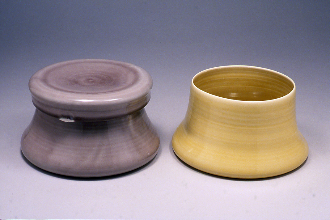
I will write notes, draw sketches and think about new forms intensely, redrawing, remodelling, playing with them in my mind's eye. Ultimately the growth of the idea depends on a symbiotic process in which the will of the mind and the will of the hand meet. This process is both subject to my 'strict arbiter' and simultaneously an attempt to locate and know the strict arbiter. A 'strict arbiter' sounds rather formidable and inflexible. However, I have found, especially while reworking and focusing on particular forms for exhibition, that it is a living breathing thing that is both subject to and engine of change. Two Creative Mindsets My focus on objects that inhabit our daily lives embraces the complex way they express humanity, from daily grind to ritual and feast. On the one hand I aim at a rationalist approach to function: the pot must have a relationship to hand and mouth, the mechanics of eating and drinking that works efficiently. On the other hand, I understand this 'efficiency' as one ingredient in the relationship between object and person, a relationship which embodies a wide spectrum of human emotion. It is the intimate relational nature of function, the capacity of objects to 'inspire a reduction of the psychic distance between one thing and another; between people and things' that interests me. I aim to reflect this intimacy, which also involves the intuitive and sensual world of the domestic, in the tactile aesthetic of my work: work that witnesses the touch of the hand rather than burying the hand under the machine. Two creative mindsets are at work here. First, the Modernist: streamlined, geometric, absolutist, utilitarian, minimalist. Second, the organic, flexible, idiosyncratic, private, intuitive attitude typified as more feminine, Expressionist, or anti-industrial. The tension fascinates me, created as it is at the boundary of contrary mindsets, the liminal space where opposite impulses meet, like 'the swans down-feather,/That stands upon the swell at the full of tide,/And neither way inclines'.9 My interest is not reconciliation, but celebration of the tense moment of meeting. The meeting of opposites is a time-honored concern for artists. Potter Robert Turner sees the 'essential contest... to be Plato versus Asia and Zen: the ideal, perfect, symmetrical, the timeless, absolute, and eternal, holding mankind over nature... as against a reality of change and time altering events of unpredictability, of the internal, the intuitive, oneness with nature'.10 Box Cup I am currently making lidded cups, 'box cups', the form originally based on a cube. It evolved from a 'soft square' shape of an earlier bowl: I thought to consolidate the form with a lid, to make a more direct statement about the 'cube'. This in turn led to looking at eighteenth century lidded cocoa cups. Functional innovation lies in a lid which, in position, has a slight dip in the centre to carry the unseeped tea-bag, a biscuit or sugar-cube. The lid also works alternately as accompanying dish for sugar/biscuit/teabag; and, in original conception, as saucer. The latter was abandoned in a compromise: I dropped the idea as the aesthetic demands of the piece evolved, although I am still attached to the idea of a dual function lid/saucer (fuel for future work). The defining issue here was the base of the cup which, through a process of remaking and re-evaluating, burst the boundaries of the cube and gradually broadened and slumped. I became increasingly fascinated by this 'slump' and now consider it the defining characteristic of the work. In the process, the lid became proportionately too small to function as saucer. There is a background to my relationship with bases. I have always found foot-rings problematic, preferring the simplicity in a pot which, like a medieval jug, sits unsupported on the table. Where there is 'lift' I like it to be integral to the form, independent of the prop of a foot-ring. However, function (specifically glazing) often dictates otherwise. I agree with the widely held opinion that the foot/base is a 'culmination of the potter's invention'.11 I experimented with alternatives: I joined strips, or patches of clay to the base with the idea that these additions would track an Expressionist, gestural mood across the otherwise still surface; I tried incised lines to loosely define a residual foot-ring. The problem was how to maintain a sense of the whole, the balance of components, the complete little world of the form with beginning, middle and end. Mostly my experiments appeared contrived and superfluous. Finally, I came upon the idea of a prop: if I could lift the cup off the kiln shelf with a prop or setter, the cup would no longer have to lift itself - it could relax further into its slump. My interest in a slumped, weighted curve also refers back to experiments I made working with the wet qualities of porcelain. I stretched and pushed the clay to points of collapse and enjoyed the softness, the sense of generosity, of bountifulness in a curve that, as it were, wants to curve more. This gesture also goes to the heart of the 'vessel's' meaning as 'container'.Ultimately, my affinity with the slumped curve is one of those inscrutables of aesthetic choice, but I can link it with a liking for 1950s industrial ware, the biomorphic work of designers such as Russel Wright and Eva Zeisel; and also with a deep sympathy for the work of American Expressionist potter Robert Turner. Foot-rings interrupt the hand's journey under a pot; they firmly speak of underside. Conversely, the box cup invites the hand to travel underneath and nurse a continuous curve. To encourage the hand's engagement further, I have impressed dents just above the point where the base begins to swell: they act as visual cues for the hand, inviting it to explore the indent and hold. There is pleasure and comfort in this tactile experience which is in keeping with the mood of the piece as a whole. The soft corners of lid and base nurse the box shape in a curved comfort which is somehow more reassuringly boxed in than sharp fragile corners allow. The glaze is smooth and silky to touch encouraging a comfortable, caressing relationship with the user. I refer to a comfort which is about softness, kindness, closeness and not commercialized indulgence. Turned over, the cup is also a convincing object to contemplate in itself. The bottom curves inward in a shallow that mirrors the shallow of the lid, again making it integral to the whole and blurring the notion of the underside. Ridding the base of preconceived indices of underside (foot-ring, wiring-off marks, untreated clay), allows it to enter into consideration in a new way: it performs a more purely formal task despite its function. The box cup has been a challenging formal exercise in balancing detail: concave and convex curves created in the throwing and turning all need to speak to each other's particular gradient. Originally an accent line one third of the way from the base played off a shadow line which the lid makes one third distance from the top. I abandoned this line because it worked too decoratively in a work which is essentially about form. However, I have retained the impressed points which I had made on either side of the line. Now these points punctuate the climb of the wall; form a stopping point in the movement of the throwing lines which creates a quiet tension, a hiatus in which to think. It is these details that engage the 'strict arbiter'. However, the form is not about strictness: the exactitude of detail belies the softness of form. To a great extent it was technical restriction which acted as creative boundary for the development of the slumped base. This was also the case with the lid. I did not want the glaze to stop short of the rim sitting over the cup, leaving an exposed white porcelain line: it would interrupt the sense of enclosure. I needed to invent an alternative way of sitting the lid on the kiln shelf. What I finally came up with are three little feet pulled down from the clay of the lid. There has been difficulty in making these work without warping and collapsing, but they do now work aesthetically as marks in conversation with the impressed points on the main body of the cup. The fact that they enter into a new proximity of relationship each time the lid is repositioned makes for a conversational openness. I make large lidded vessels of the same form as the cup. What changes in the transmigration has to do firstly with function. The shape fits more conventionally into the lexicon of ceramic cup shapes, but as bowl, it becomes something altogether more strange and challenging. In this way the two shapes make an interesting partnership, juxtaposing familiarity with something strange, almost suggesting the uncanny. The slumped base continues to work functionally, even if we are less accustomed to working a spoon over a slumped interior curve. The closed cube form which suggested comfort and preciousness, emotions in keeping with feelings we have about tea/coffee, becomes more surprising when applied to a bowl: here we normally expect a gesture of offering and openness. The challenge inherent in this strangeness, however, appeals to me, especially as I feel it is posed in a quiet way, and not by dramatically deconstructing our preconceptions about form. Porcelain I started to use porcelain in my second year at college when it spoke to me of pottery that I admired: the work of Edmund de Waal, Takashi Yasuda, Gwyn Hanssen Pigott, Byron Temple, Tsubusa Kato, Joanna Constantinidis . Naively, perhaps, it also spoke to me of a world of objects thrown with grace and exquisite judgement. I am interested in Minimalism, and naturally the purity of porcelain suggests the world of artists such as Robert Ryman, Agnes Martin. The choice was not rigorously informed or clearly conscious: rather it is in retrospect (like so many artistic choices) that I understand how it happened. It also makes sense in terms of the work I now make. My work pays witness to the particular qualities of porcelain: its unique elasticity addressed in the slumped curve; its strength utilised in the thin throwing; its whiteness used behind a transparent glaze like cotton paper behind a watercolour. I also use porcelain because it is so sensitive and responsive to tactile endeavour and tells the story of the hand's journey across the clay so lucidly. Finally, quite simply, on a visceral level I enjoyed the sensuality of porcelain in use. If pushed, I would situate my work in a tradition, perhaps nascent in the UK in the 1980s, of altered, mimimalist porcelain vessels. That said, I do not self-consciously ally myself definitively with any tradition. I have gone on to use earthenware and would say I have no sentimental attachment to any material or process: what I am committed to is 'materiality', the clay, the wood, the thing in and of itself, very much in the Modernist tradition. Glaze Initially, I worked with green/blue celadons, but abandoned this because celadon is so over determined in the contemporary field: as a student maker I felt claustrophobic and predetermined. I then tried to develop a pink celadon-type glaze: a kind of soft twilight pink. The tone and mood of the pink had much in common with the subtle blues that celadon affords. It was also intended to be in keeping with something fleshy and comfortable about slumped porcelain. I was looking for colours that do not hit full on, but reveal themselves in time; colours which are an invitation to contemplation and quiet. I was struck by Philip Rawson's thesis that our modern experience of multiple and hectic colour makes dull and dim colours which may have been stimulating to earlier cultures.12 I was also inspired reading Junichiro Tanizaki's In Praise of Shadows where he describes the Japanese appreciation of murky light, lack of clarity, shadows and subtle colour. Here is his description of gold leaf on a screen:
Attunement to subtlety is one of life's great pleasures and opens up experience to infinite possibility; requirement for boldness can strike the moment dead in one blow. The pink glaze was beset by technical difficulties, mostly to do with firing temperature, and I decided to abandon it for the present. I do not consider glaze technology my strength: I am, as Cardew described himself, more of a 'mud and water' than a fire person. Finally, I chose some of the other colours which had arisen during experiments and inhabit the same qualities: a palette of greys and yellows. These transparent glazes have a water-colour effect, where the intention is to allow the mark-making from the throwing process to speak through and with the glaze. The shiny, running glazes are reminiscent of wet, freshly thrown clay and so preserve the moment of making. The making marks, or 'notches in the heart' as artist Yamaguchi Katsuhiro called them, are a 'basic prehensile act still resonating within human endeavour in the contemporary age of mass media, television'.14 On the one hand, the glaze is clearly contained by the exactly designed ring at the base, and on the other hand, it has none of the precision of an industrialised glaze: in this way it comprises the 'two mindsets'. I also enjoy the clay undressed and have decided to try leaving the outside of some pots unglazed, firing to 1300C. This has the effect of almost impacting the clay particles in on themselves and results in a fine textured, intense surface which is reminiscent of stone or sun-baked earth. In a group of work, it provides a strong contrast to the shiny transparent glaze. Developing this further, I chose to work with unglazed earthenware, fired to the limit of its maturing temperature so that the clay almost looks burnt and friable. The palette orchestrated between these varying surfaces and colours allows breathing space: suggests that any one experience is not summed up by one view. The idea is to orchestrate a collection of textures, surfaces and colours in a group of pots which communicates varying sensual states and reflects the changing nature of our emotional lives. This is an urge towards openness and inclusiveness rather than finish and exclusivity. Skill / Craft It has been one of my foremost aims to acquire the ability to throw, and to throw well. It is the alphabet, the musical scale, the ground rules which ultimately afford freedom, grace, beauty. W.H.Auden expresses the point very well when discussing T.S.Eliot:
But that sort of grace is the end point of a long process, first of learning technique (every technique is a convention and therefore dangerous) and then unlearning. It is much easier to learn than to unlearn, and most of us will not get further than learning.15 There is a second aspect of skill which interests me and traditionally characterizes craft. This is the labour intensive, time involved, repetitive nature of it which implies: human presence; mindful attention; lingering pace. Skill graphically witnesses these qualities in work such as the deftly coiled pots of Sarah Scampton which record each making mark, or the elegantly thrown and altered jars by Byron Temple where the softness of the throwing is given accent with exactitude of detail and turned lids. But it need not be graphically illustrated in order to be felt: the human hand communicates these qualities powerfully, simply by applying itself skilfully to the clay. Conclusion These reflections chart and are bound into my time at college and remain rooted in that experience without necessarily translating wholesale into the present. They navigate a path through some of the issues which confronted me as a student making functional ware, but most significantly witness a meandering attempt at self definition. I believe my essential lesson at college was to develop a mode of working with this process of self-definition, of relating to a creative self. It is a mercurial and slippery task, but that is intrinsic to its usefulness. 1. Pamela Johnson, 'Joined up thinking', Ceramic Review, no.187, January/February 2001, p.32. back to text 2. Ibid. back to text 3. Marsha Miro and Tony Hepburn, Robert Turner, Shaping Silence, A Life in Clay , Kodansha International, 2003, p.79. back to text 4. I bid , p.96. back to text 5. www.droogdesign.nl back to text 6. Clive Bell, 'The Aesthetic Hypothesis' in Modern Art and Modernism , Open University Press, 1982, p.68. back to text 7. Bernard Leach, A Potter's Book, London, Faber and Faber, 1976, p.1. back to text 8. Gwyn Hanssen Pigott, 'The Rightness of Form', Ceramic Review , no.207, May/June, p.25. back to text 9. William Shakespeare, Anthony and Cleopatra , Act III, scene ii, lines 48-50, Routledge, The Arden Shakespeare, 1991. back to text 10. Miro and Hepburn, Robert Turner , p.80. back to text 11. Philip Rawson, Ceramics , University of Pennsylvania Press, 1984, p.46. back to text 12. Ibid , p.130. back to text 13. Junichiro Tanizaki, In Praise of Shadows , Vintage Press, 1977, p.35. back to text 14. Louise Allison Cort & Bert Winther-Tamaki, Isamu Noguchi & Modern Japanese Ceramics, A Close Embrace of the Earth, The Arthur M.Sackler Gallery, University of California Press, 2003, p.54. back to text 15. Quoted in 'Ryoji Koie; New Works in Porcelain' catalogue, Galerie Besson, 1998, p.2. back to text |
|
||||||||||||||
| A Student's reflection on making pots for use • Issue 7 | |||||||||||||||