Interpreting Ceramics | issue 15 | 2013 Conference Papers & Article |
|
||||||||||||
Bloomsbury in Dorset: Manufacturing Modernisms at Poole Pottery 1914-1939James King |
|
||||||||||||
|
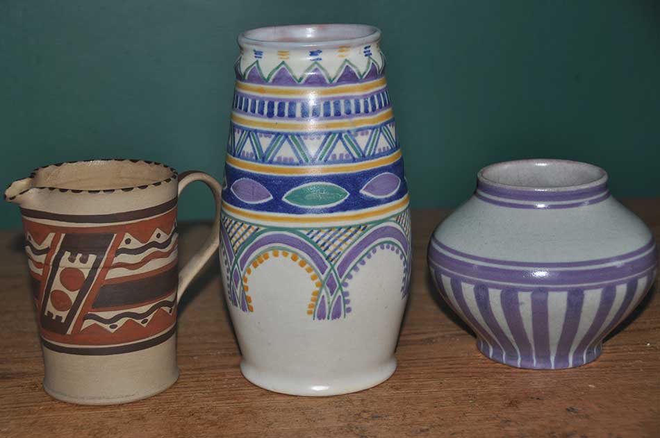
Abstract ‘A More or Less Experiment’ Poole stood apart from its competitors because of its location in Dorset, far removed from the Potteries in Staffordshire. Poole can also be singled out from other firms by its insistence on retaining as much as possible of the ideals of the Arts and Crafts movement into the look and production of its wares. A third distinguishing mark of Poole is its insistence in incorporating ideas of good industrial design into its wares, and, specifically in the 1920s and 1930, strong elements of high modernism and Post-Impressionism in the appearance of its wares.2 The developments at Poole must be placed in context. In about 1900, Walter Moorcroft had established himself as the predominant manufacturer of high-end Art Nouveau inspired wares. In 1903, Minton attempted to establish itself in this market niche by introducing its Secessionist wares. In Dorset, Poole did not attempt to compete in the same design arena as these two other firms. In 1900, for instance, the company introduced a range of luster-glazed stonewares, a kind of pottery produced by many other firms. Poole's movement in radical new directions began in earnest in 1914 when Roger Fry approached Roger Carter, Charles Carter's son, for assistance in learning about throwing and decorating pottery. A year earlier, in 1913, the Omega Workshops had been begun by Fry, who envisioned a new kind of enterprise wherein the artist became involved in craft work in which his artistic powers could be constantly occupied. Two years earlier, Fry had organized his second exhibition of Post-Impressionist painting. Both initiatives were attempts on his part to counter the hostility he found in England to the advanced, experimental continental developments in art in which he felt his fellow countrymen were indifferent. In his booklet advertising the Omega Workshops, Fry labeled it as ‘a group of artists who are working with the object of allowing free play to the delight in creation of objects for common life.... They try to keep the spontaneous freshness of primitive or peasant work, while satisfying the needs and expressing the feelings of the modern cultivated man.’3 The Omega Workshops' headquarters was at no. 33 Fitzroy Square, a tall, terraced Georgian house. A signboard painted by Duncan Grant was hung outside; on each side of the front window were panels decorated with dancing figures by Grant and Bell. The two showrooms were on the ground floor. In addition to proffering a wide range of individual products, such as painted furniture, murals, stained glass and textiles, the Omega Workshops offered interior designs for various kinds of living spaces. In 1913, it was commissioned to decorate a room for the Ideal Home exhibition; an illustrated catalogue, including text written by Fry, was published in autumn 1914. Fry had a very focused, fixed agenda, so determined was he that Post-Impressionism should infiltrate the English domestic sphere; it should do so ‘by extending it to the applied arts, and thus introducing [Post-Impressionism] more fully into our homes in the shape of mural decorations, upholstery, and decorative furniture of all kinds.’4 A writer in The Times made an even stronger declaration in which he made the crucial distinction that in Post-Impressionism there is always a causality between the representations of real objects and the abstractions in which they are cast: ‘Only an artist of very great ability can combine the amount of representation in most patterns with a fine abstract design.’5 About the possibility of the status of pottery being elevated to genuine art, Fry had little doubt: ‘Pottery is essentially a form of sculpture, and its surface should express directly the artist's sensibility both of proportion and surface.’ Omega pottery, he also observed, ‘is made on the wheel by artists and is not merely executed to their design. It therefore represents, as scarcely as any modern pottery does, this expressive character.’6 In a particularly rhapsodic turn of phrase, he proclaimed: ‘Pottery is of all the arts the most intimately connected with life.... A poet or even a painter may live apart from his age, and may create for a hypothetical posterity; but the potter cannot, or certainly does not, go on indefinitely creating pots that no one will use. He must come to some sort of terms with his fellow-men.’7 He also observed: ‘One of the essences of Post-Impressionism is the return to a more architectural and structural basis of design, and is therefore peculiarly adapted to the applied arts.’8 Despite good intentions, Fry's early efforts to produce pottery to his standards were in large part defeated because he was using commercially made blanks. To rectify this situation, he and Vanessa Bell took lessons in throwing. [Fig.1] Eventually, in 1914, Fry, at the instigation of his secretary, Winifred Gill, make contact with Roger Carter. Fry began travelling to Poole to learn throwing, glazing and decorating.
Many of the employees at Poole looked bemusedly at the efforts of the Omega visitors. These wares, especially in contrast to Art Nouveau inspired designs, were stylishly simple, used plain, undecorated glazes in strong colours; only a few incorporated geometric, abstract and figurative patterns in emulation of contemporary trends in fine art. One person at Poole viewed the work of the outsiders with considerable admiration. James Radley Young, who had first joined Poole in 1893 and then left in about 1901 to work at the Hammer Vale Pottery, rejoined the firm six years later. Obviously influenced by geometrical patterning he found in near Eastern art, he also began in about 1914 to experiment with Moorish and Egyptian inspired designs; he had a penchant for simple band patterns, which were referred to at the time as ‘Portuguese Stripes’. His patterns were and remained predominantly geometrical in appearance on unglazed ware and were in production into 1920. They were on display at the British Industries Fair in 1917 and 1921. [Fig.2]
In 1920, Poole proclaimed: ‘We are proud of our pots. Started by Mr. Young...they have met with a very encouraging reception by the discriminating public, with the result that what started more or less as an experiment has now become an established...factor in our business.’ Very significantly for later developments was this statement of intent: ‘In our Handcraft Pottery, we aim at achieving simplicity of shape and decoration, and at giving individuality to each pot. In no case are the shapes moulded, but they are each thrown by the potter, no two pieces being identically the same; even when pots are somewhat similar in shape the decoration is varied, and all the designs are hand-painted.’9 The Hardware Trade Journal seconded its approval of these hand-thrown, glazed and unglazed wares: ‘the fresh colours and striking pattern made up of spots and brushwork stripe effects are in harmony with the shape; new treatments are green and black, soft mauve and green, and rendering of Portuguese, Persian and Moorish styles.’10 In the 1910s, there remained a sharp divide in the pottery industry between conventional lustre and art nouveau wares and the more advanced wares of Poole, the latter obviously in large part inspired by the Omega Workshops and its advocacy of a new form of pottery. Poole's commitment to such experimentation can be seen in the company's Report for the Year 1920, in which Cyril Carter declared: ‘what started more or less as an experiment [James Radley Young's designs] have 'met with a very encouraging reception by the discriminating public, with the result that [it has] become an established, though comparatively small, factor in our business.’11 ‘New Fields to Conquer’ James Radley Young's unglazed ware held sway at Poole throughout the 1910s and the beginning of the 1920s, but new forces came into play, especially at the 1925 Paris Exposition des Arts Décoratifs, which unleashed the wide plurality of styles now (somewhat problematically) referred to as Art Deco. Whereas Art Nouveau had relied on sensuous, curving lines, some manifestations of Art Deco have straight lines and sharp curves; this style is often referred to as International Modernism. Such designers were attempting to embrace a gestalt that was concerned with a completely new, energized, forward-looking and machine-inspired vision of the world. Other practitioners of this style used bright, flamboyant colours and incorporated elements of cubism into their work. Such designs are often categorized as Jazz Age.12 In the Potteries, there were varying responses to these new design imperatives. At Wilkinson's, for example, various shapes were invented to capture Jazz Age aesthetics, and Clarice Cliff made designs that matched those forms; she was responsible for most of the accompanying new shape designs.13 A firm such as Moorcroft paid little attention to the new modernisms: chevrons were added to some designs, but little more was done to accommodate the new age. At Poole, Young's designs could still be marketed as manifestations of forms of International Modernism (in this instance, strong emphasis on brightly coloured geometrical lines). The Hardware Trade Journal of 27 August 1920, as noted above, commented approvingly.
However, the Poole product line needed rejuvenation, which came with John Adams and his wife, Truda. John Adams studied at Hanley School of Art, joined the design studio of a tile-producing firm, and studied at a local art school in the evening. In his early twenties he joined Bernard Moore's decoration studio, which specialized in flambé and lustre ware. As Adams recalled, his time in London brought him into touch with a wide variety of cultural experiences such as watching Nijinski and Kharsavina perform at Covent Garden with the decor designed by Bakst for L'ápres-midi d'un Faune.15 After completing his studies, Adams remained at the Royal College on staff and married Gertrude (almost always known as Truda) Sharp, a fellow Associate of the Royal College of Art.16 In 1914 they moved to South Africa where he became Head of the School of Art at the Durban Technical College. The couple established the pottery section at the college but by 1921 they were disillusioned with art education in South Africa and accepted an invitation to join Poole. In that year, Carter, Stabler and Adams, a subsidiary of Carter and Co., was formed to reflect Adams’ presence: Cyril Carter was responsible for management of the firm, Harold Stabler acted as an external design consultant and John Adams was appointed Managing Director, although design and technical advancement were his responsibilities. At Poole, Adams's first major contribution was to introduce glazes based on experiments made by studio potters. In doing this, he moved away from prevailing industry standards. He also designed new shapes for vases, jars and covered bowls. These initiatives followed the lead of Gordon Forsyth, the leading theorist in the 1920s, about the future of design in the pottery industry. His strident declaration from October 1921 echoes what Fry had been preaching a decade earlier. Only by art could the pottery industry gain ‘fresh ground and find new fields to conquer...The artist as designer...should have imagination, a thorough knowledge of processes and methods of pottery decoration (which naturally includes a thorough knowledge of historical styles) and last, but not least, a real veneration for his craft.’17 Adams's firm penchant for International Modernism can be glimpsed in his Everest and Sylvan Wares, which are largely monochromatic and angular.18 The clean simple, streamlined Everest Ware was the obvious inspiration for Keith Murray's later designs for Wedgwood. [Fig.3] Adams also designed painted wares with patterns in imitation of Mondrian.
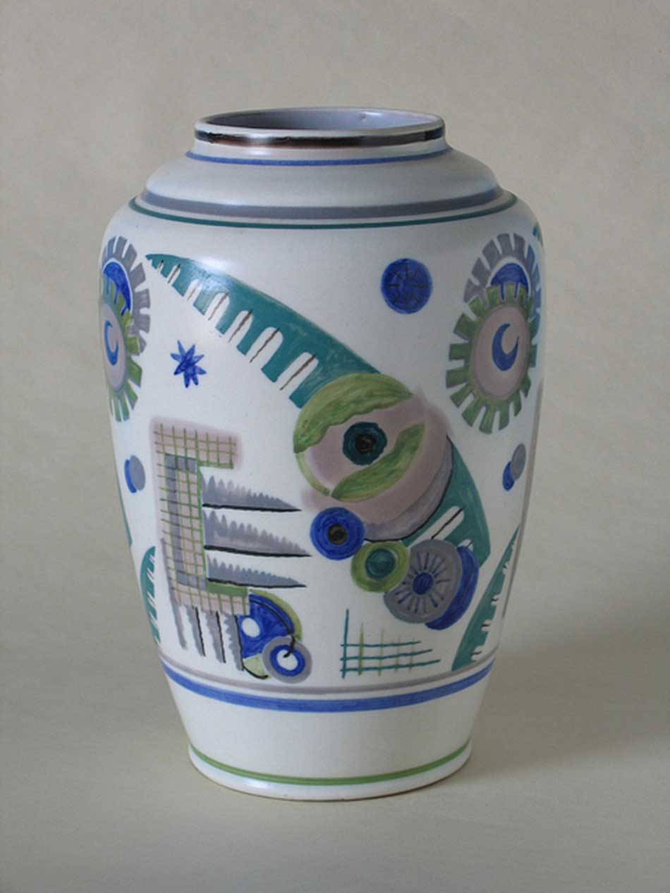
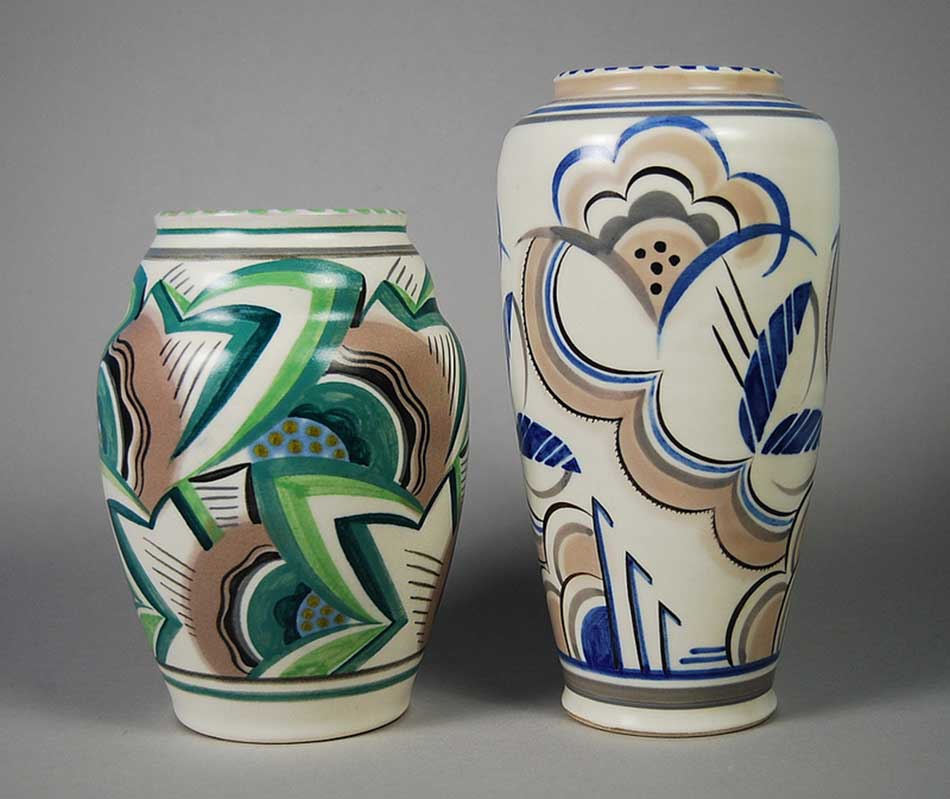
A Far-Ranging Eye At Poole, Truda Carter began by toying ith and modifying with the Young designs. Although his design initiatives helped provide her with a congenial atmosphere in which to experiment, his approach did not suit her. As a student at the Royal College of Art, she had specialized in embroidery design and was particularly interested in Jacobean and late Tudor materials. Unlike John Adams from whom she was divorced in 1925 (she married Cecil Carter in 1930), her eye was attracted to juxtaposing polychrome triangular, circular forms with equally polychromatic floral forms that often become extremely abstract. She relied on organic form even though many of her major designs incorporate the sharp, angular lines of International Modernism. She always remained dependent on organic forms even when moving in the furthest directions of abstraction. In the process, she created a unique look to her wares.19 Carter's sources were extremely varied. Jacobean embroidery often emphasizes the head of a flower in a manner similar to some of Carter's designs. Carter was also indebted to Dutch Gouda pottery (often referred to as peasant pottery in the 1920 and 1930s), which also practices a similar use of compositional space to isolate flowers. Carter's work also had an intimate knowledge of the French ceramist, René Buthaud.20 More recently, it has been demonstrated by Stella Beddoe that Carter employed at least three floral patterns from Charlotte Raisin's Le Décor Moderne dans la Tenture et le Tissu (circa 1930) and a direct copy from Eugène A. Séguy's Suggestions pour étoffes et tapis - 60 Motifs en Couleur (1927/28) for one other.21 Carter may have liked to adapt flat patterns because she realized that the three dimensional form of pottery would show the designs off in a completely different way. She was obviously well aware that her adaptations would look markedly different when placed on pieces of pottery. In the following paragraphs I refer to a small number of patterns by Carter, but I should like to emphasize that my remarks can be extended to embrace all her designs. Patterns such as LE, which was described by the Pottery Gazette on 1 March 1928 ‘as a freely painted design in the 18th century Strasburg manner’ [Fig.4] do not stray far from their Continental sources. At the other end of the spectrum is the determinedly aggressive avant-garde statement being conveyed in XD. [Fig.5] Neither extreme represents the full integration of representation with abstraction in this designer's repertoire.
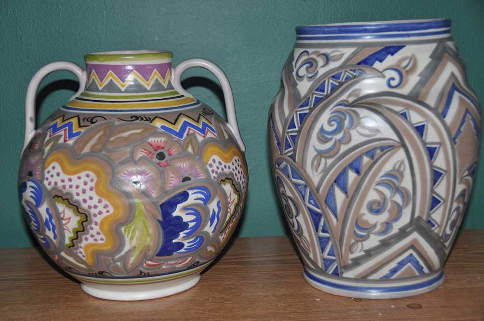
In BX, the floral forms are so exaggerated as to take on an otherworldly, almost sinister aspect. This pattern, in which the anatomies of the flowers are so emphasized that they move in the direction of abstraction, may derive, as already suggested, from pieces of Jacobean embroidery in which individual flower heads were often emphasized, but Carter's treatment erases the past and gives a distinctly contemporary edge to the design. Very much in the manner of Burthaud, Carter integrates representation and abstraction into this design. In YE, Carter uses a restricted palette of yellow, brown and black against a white ground. Some of Carter's designs (such as YE) exist in both polychrome and restricted colour variants. Here, Carter strove to balance the lightning-like chevrons with an abstract floral design. [Fig.6]
In the intensely polychrome colour scheme of EP, the flattening of the floral forms owes a great deal to the Gouda pottery tradition, but the intense saturation of colours is Carter's own as is the addition of the chevrons. In BC, remnants of organic forms can be seen, but the leaf forms have moved towards almost complete abstraction. [Fig.7] In some instances, Carter transforms organic forms into almost pure abstractions. [Fig.8]
Carter possessed an eclectic eye, and this makes it difficult to pinpoint sources. However, I should like to suggest another major indebtedness for Truda Carter's designs: the Omega Workshops. Carter's patterns for Poole show a nodding acquaintance with the pottery produced by Fry, Bell and Grant: Vanessa Bell's use of overall geometric form in some pieces of pottery foreshadows Carter. Carter herself obviously followed Radley Young in his response to the Omega Workshops. However, Carter's designs show a stronger affinity to the textiles and screen designs produced by that group than they ever do to their pottery. Given Carter's interest in embroidery and her use of French textile designs, this is perhaps not unexpected. Duncan Grant's Design for a Firescreen of about 1913 places two birds and five flower heads against a variety of geometric forms. ‘Amenophis,’22 a printed linen design by Roger Fry of the same year displays a variety of abstract shapes, but their roundness suggests living, organic form. Duncan Grant's carpet design for the ocean liner Queen Mary of 1936 displays a variety of flowers juxtaposed to an assortment of non-representational forms. A cotton fabric designed by Vanessa Bell of about 1933-4 places vases of flowers against a wide variety of abstract forms. In these instances, the Omega Workshop artists are employing design methodology similar to that of Truda Carter. Fry's pronouncements about Post-Impressionist painting always emphasize that such canvases must make a connection between the object represented and its corresponding abstraction. He is claiming that such works of art inhabit two spaces simultaneously. As we have seen, Truda Carter always sought to conjoin the representation of various flowers with geometrical, abstract forms. This remains her distinct contribution to modernist ceramic design in England in the inter-war years.23 Even early Omega pottery with its colourful semi-abstractions shies away, except in a few instances, as I have argued, from the kind of design favoured by Carter. Later Omega wares, almost always monochromatic, owe much to the Chinese tradition such as found in the Northern Song dynasty.24 However, Fry's doctrines - and their long-lasting influence - must be taken account. At his first seminal exhibition of 1910, ‘Manet & the Post-Impressionists,’ Fry included nine ‘vases en faïence’ painted by the Fauve artists Andre Dérain, Maurice de Vlaminck, Othon Griesz, Pierre Girieud and Henri Matisse in cooperation with a professional potter, André Metthey. These were objects, to Fry's way of thinking, which could stand side by side with paintings. In this regard, a polychrome vase by Dérain from 1906 (very similar to the nine at the 1910 exhibition) bears a striking resemblance to a Truda Carter design in the way that the tendrils are conjoined to the abstract elements. [Fig.9]
Without doubt, any evaluation of Carter's work must take into account that she had the uncanny inability to fuse several strands together in the same design, but Carter's eclectic eye was obviously influenced by the aesthetical underpinnings of the Omega Workshop. Despite the fact that Carter's designs in the 1920 and 1930s do not look like Omega pots, she had internalized design elements derived, via Radley Young, from Fry's concept of Post-Impressionist aesthetics. Moreover, there is a clear lineage from Omega to Young to Carter. In this sense, Bloomsbury aesthetics survived in Dorset well beyond Fry's brief time there. Conclusion In Objects of Desire: Design and Society since 1750 (1986), Adrian Forty argues that commercially successful, manufactured goods embody dominant ideas about social reality; such objects are designed to give the consumer the illusion that their possession reflects both good taste and social status. Forty deftly argues that although Josiah Wedgwood in the late eighteenth century was instrumental in introducing many technical innovations into the manufacturing of pottery, his great commercial success was in giving his wares a neo-classical styling that made them look like products of a golden, by-gone age. Likewise, Poole manufactured high-quality items intended for educated, prosperous buyers. In 1937, in An Enquiry into Industrial Art in England, Nikolaus Pevsner observed: ‘Roger Fry's exhibition at the Grafton Galleries and his Cézanne propaganda are as memorable for English painting as is the foundation of his Omega Workshops for modern English handicraft.’ However, Pevsner lamented, not much of an advance had been achieved in the upper classes: ‘The most serious obstacle to its divulgation lies in [their] attitude ... Owing to the general conservatism mentioned, to inborn reserve and a distrust of anything that looks strikingly new, the majority of the English upper classes, above all the aristocracy, still prefer period decoration, period furniture, period porcelain, etc. - whether genuine or reproduced - to modern industrial art.’ Still, there was reason for hope: ‘At present it appears to be the professional class mainly, and a small minority of wealthy merchants and industrialists who uphold the modern style. Still, their taste is also bound to filter down by degrees.’25 My argument is that Poole attempted to introduce the ‘strikingly new’ into ‘modern industrial art’. In that sense, they created objects of desire. Top of the page | Download Word document | Next Notes 1 See, for example, the extended discussion in Jennifer Hawkins, The Poole Potteries, Barrie & Jenkins, London, 1980, pp. 51, 52, 53, 55, 56, 58. In general, the secondary literature on Poole and on the pottery industry as a whole is confined to discussions of individual designers and questions of connoisseurship. In this regard, Leslie Hayward and Paul Atterbury, Poole Pottery, Richard Dennis, Somerset, 1995 is essential. The single most valuable guide to the socio-economic complexities of the Potteries can be found in Cheryl Buckley, Potters and Paintresses; Women Designers in the Pottery Industry, 1870-1955, The Women's Press, London, 1990. Andrew Casey, 20th Century Ceramic Designers in Britain, Woodbridge, Antique Collectors' Club, 2001 contains a great deal of useful, documentary information. Judith Collins, The Omega Workshops, Secker & Warburg, London, 1983 provides the most comprehensive treatment of its subject, but it should be used in conjunction with Isabelle Anscombe, Omega and After: Bloomsbury and the Decorative Arts, Thames and Hudson, London, 1981. 2 Any discussion of the aesthetic history of manufactured pottery is hampered by the absence of archival material that raises such concerns. A great deal of accurate, historical information about manufacturing processes and work relationships in the Potteries can be found in, for example, P.W. Gay and R.L. Smyth, The British Pottery Industry (London: Butterworths, 1974) and Richard Whipp, Patterns of Labour: Work and Social Change in the Pottery Industry (London and New York: Routledge, 1990). The trade magazines devoted to the Potteries do not touch on this issue. Advertisements in trade and popular magazines are not particularly helpful. With the exception of material quoted in my text, the works cited in note 1 (above) do not contain information related to aesthetics, taste or class as an arbiter of taste. In Household Gods: The British and Their Possessions (New Haven and London: Yale, 2006), Deborah Cohen, employing a wide variety of sources over a long period of time, advances an argument that links concepts of class, taste, and good taste to home decoration. I have not been unable to uncover any primary material to support directly my argument about how the ‘look’ of Poole Pottery is distinctively different from the ware produced by most manufacturers. However, my contention is that certain manufacturers, especially Moorcroft, Minton, Wedgwood and Poole, produced wares to appeal to consumers who were well educated and with sufficient means to acquire ‘cutting edge’ pieces of pottery that imitated or incorporated elements from Post-Impressionism, Cubism and Vorticism. Clarice Cliff and her paintresses also amalgamated many modernistic elements from the fine arts into their wares. See note 19 below. 3 Omega Workshops Ltd. brochure. 4 Pall Mall Gazette, 11 April 1913, p. 3. 5 The Times, 9 July 1913, p.4. 6 Omega Workshops Ltd. brochure. 7 Roger Fry, ‘The Art of Pottery in England,’ Burlington Magazine, March 1914, p. 330. 8 Pall Mall Gazette, 11 April 1913, p. 3. 9 Cyril Carter, A Report for the Year 1920, Poole, Carter & Co. 10 The Hardware Trade Journal, 27 August 1920. 11 Quoted by Hawkins, The Poole Potteries, p. 67. 12 The term is problematical because the term is often used in an extremely general, catch-all way that renders it almost meaningless. See Paul Atterbury, ‘Art Deco: The International Background,’ in Sue Lunt, Age of Jazz British Art Deco Ceramics, The Bluecoat Press, Liverpool, 2008, p. 8: ‘Art Deco appears to a modern audience to be a straightforward and easily defined style. The reality is very different - a series of widely varied styles reflecting diverse sources and degrees of nationalism, linked only by time and by a vague enthusiasm for Modernism.’ For this reason, I have avoided using this term in this essay. 13 Her renown as a designer began when she was given a wide assortment of blank pottery pieces to decorate. Later, she designed many truly ‘Bizarre’ shapes such as the yo-yo vase. However, much of her work can be found in quite ordinary vase and jug shapes. 14 Quoted by Hawkins, The Poole Potteries, p. 68. 15 ‘Potter's Parade No. 18,’ Pottery and Glass, November 1950, p. 60. 16 She was the daughter of David Sharp (1840-1922), MD, FRSA, a distinguished entomologist who became Curator of Zoology at Cambridge University. Truda was born in Wilmington, near Dartford in Kent, in 1890 and died in 1958. Apart from this information and that given in the text of this paper, nothing else is known about her personal life. For example, there is no known photograph of her. 17 Pottery Gazette and Glass Trade Review, August 1921, p. 130. 18 Adams also designed a number of splashed glazed designs employing abstract shapes. He also developed a line of Chinese blue glazed wares in the 1920s; this ware resembles Fry's experiments (after 1916) with Northern Song dynasty glazes and shapes. 19 She also had what might be called her bread-and-butter patterns involving fuchsia-like flowers, bluebirds and gazelles. 20 See the illustrations on pages 56, 58, 63, and 67 in Pierre Cruège, René Buthaud, 1886-1986, Les Éditions de l'Amateur, Paris, 1996. 21 'Jazz Age Poole: English Art Deco Pottery,' exhibition catalogue, Brighton Museum and Art Gallery, The Balcony Gallery, 21 May-15 September 1998, pp. 2, 3. 22 Fry's title is a reference is to Amenhotep III (sometimes read as Amenophis III), the ninth pharaoh of the Eighteenth dynasty. Fry was indicating that this design was Egyptian in inspiration; fascination with Egyptian antiquities in England predates the 1922 discovery by Howard Carter and George Herbert, 5th Earl of Carnarvon, of Tutankhamen’snearly intact tomb. Of course, the subsequent worldwide press coverage of the find led to widespread interest in all fields in the arts.According to Pamela Diamond, Fry's daughter, the source for this design was her father's painting, Still Life with Jugs and Eggs (1911-2; now in the collection of the Art Gallery of South Australia). 23 There is no surviving correspondence by Truda Carter. There are no extant archival records, aside from designs in pattern books, from her time at Poole, much less any document that speaks to intent. The positioning of Poole as a firm that attracted the high end of the consumer market can only be documented by its advertisements in trade magazines. In those ads, the wares are photographed in living spaces suggesting wealth and refinement. In order to mount my argument, I cannot rely on any supporting written evidence to buttress it. However, I have chosen photographs of Carter's ware that supports my argument. See note 2 above. 24 See Julian Stair, ‘The Employment of Matter: Pottery of the Omega Workshops,’ in Beyond Bloomsbury: Designs of the Omega Workshops 1913-1919, ed. Alexandra Gerstein, London, Courtauld Gallery, 2009. 25 An Enquiry into Industrial Art in England, Cambridge, Cambridge University Press, 1937, pp. 206-7. 26 As quoted by Virginia Woolf, Roger Fry, London, The Hogarth Press, 1940, p. 117. (The quotation comes from the preface to the catalogue of the 1912 Second Post-Impressionist Exhibition). |
|||||||||||||
Bloomsbury in Dorset • Issue 15 |